A well-written manuscript deserves more than just good words. In today’s publishing world, readers make snap judgements about a book’s quality the moment they open it. Before they’ve absorbed a single sentence, they’ve already felt whether the layout is comfortable or cluttered, inviting or exhausting. That first impression is shaped almost entirely by typesetting. It is one of those behind-the-scenes crafts that readers never consciously notice until it goes wrong. And when it does go wrong, it can quietly undermine even the most compelling story.
What Is Typesetting?
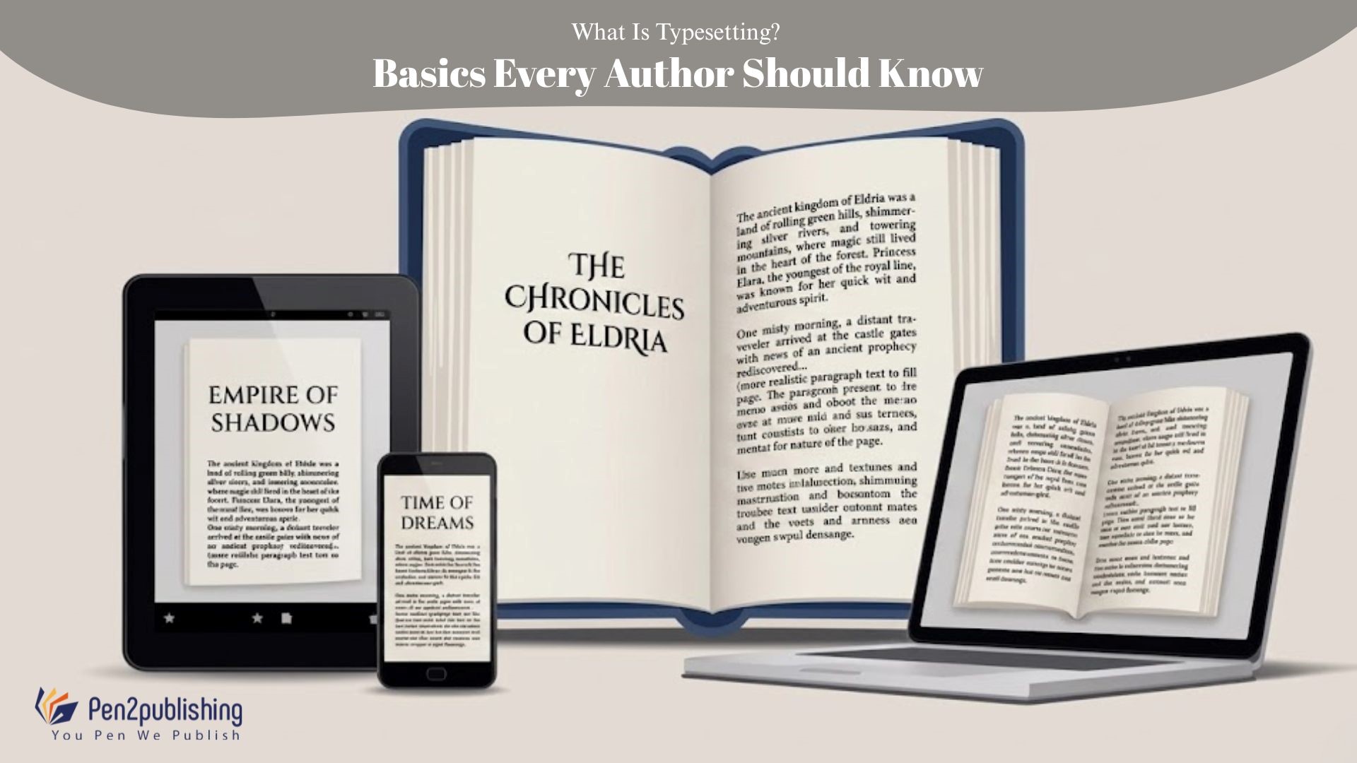
Think of typesetting as the process of turning your finished manuscript into an actual book. Not just a document with words in it, but a structured, visually considered publication that a reader can move through without effort.
It covers everything: the typeface you choose, how much space sits between lines, where the margins fall, how chapter openings are designed, and how all of these elements hold together consistently from page one to the end. Done well, typesetting is invisible. Done poorly, it is the first thing a reader notices and often the reason they put a book down. A properly typeset book simply feels better to read. That feeling is not accidental.
Why Does Typesetting Actually Matter?
Here is the honest answer: even brilliant writing can feel like hard work when the formatting is fighting against the reader. Cramped lines tire the eyes. When fonts don’t match, it feels like something is wrong. Pages without enough breathing room feel dense and uninviting. None of this is the reader’s problem to solve; it is the author’s responsibility to prevent.
Beyond reader comfort, typesetting also signals credibility. A professionally formatted book tells booksellers, reviewers, and readers that the author took the whole project seriously, not just the writing, but the presentation. In a crowded market, that signal matters more than most authors realise.
And practically speaking, proper typesetting ensures your book actually works. Print files need to meet precise printer specifications. eBook files need to display correctly on a Kindle, an iPad, a phone screen, and everything in between. Getting the formatting right from the start saves a great deal of expensive, time-consuming trouble later.
The Key Elements That Make It Work
Good typesetting is not one big decision, it is dozens of smaller decisions that need to work together.
Font selection sets the tone before anyone reads a word. Serif typefaces, with their small finishing strokes, have been the standard for printed book body text for centuries because they guide the eye smoothly across long passages. Sans-serif fonts often work better for headings, captions, and screen-first content. The key is not which font you choose, but choosing deliberately and staying consistent.
Line spacing and margins are where a layout earns its readability. Tight spacing makes pages feel suffocating. Too-wide spacing makes text feel disconnected and adrift. Most professionally typeset books use line spacing somewhere between 1.15 and 1.5 enough to let the text breathe without losing the sense of flow. Margins do the same job horizontally, giving the reader’s eye a clear path and the reader’s thumbs somewhere comfortable to rest.
Paragraph alignment in printed books is almost always justified flush on both left and right margins because it creates the even, column-like appearance that readers associate with published books. Digital books more often use left-aligned (ragged right) text, which adapts more gracefully across different screen sizes and font settings.
Chapter layouts are the punctuation marks of a book’s visual rhythm. A well-designed chapter opening with considered spacing, a clear chapter number or title, and a clean start to the body text signals structure and gives the reader a moment to settle before the next section begins.
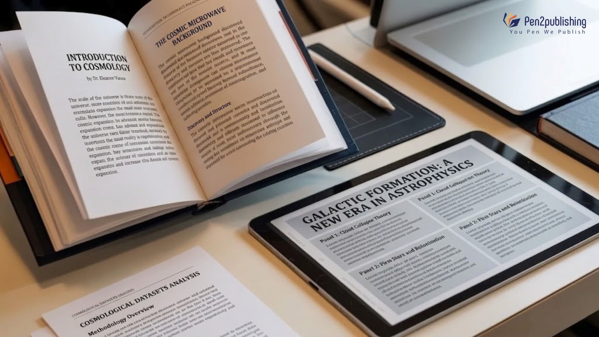
Print Books and eBooks Are Not the Same Problem
This is something authors frequently underestimate, and it costs them.
- A print book has fixed pages. Every reader sees exactly the same layout, in exactly the same proportions. That means your typesetter must think carefully about trim size, bleed margins, gutter width, spine calculations, and how text and images will sit on facing pages. There is no flexibility once the file goes to the printer it needs to be right.
- An eBook works completely differently. The layout has to adapt automatically to whatever screen the reader is using, whatever font size they prefer, and whatever reading app they have open. A file that looks beautiful on a tablet may collapse entirely on a phone if it has not been properly built. Testing across multiple devices before publication is not optional; it is the only way to know your book actually works for real readers in real conditions.
These two formats require genuinely different technical approaches. Trying to use one poorly formatted file for both is one of the most common and most preventable mistakes in self-publishing.
Mistakes That Quietly Damage Books
Most formatting mistakes are not dramatic. They accumulate quietly, page by page, until the overall impression is one of carelessness.
Decorative or mismatched fonts make body text harder to read and give the layout an unfinished feel. Uneven spacing whether too tight or too loose disrupts the reading rhythm that good typography is designed to create. Single lines stranded at the top or bottom of a page (widows and orphans, in typesetting terms) break the visual flow in ways readers feel even when they cannot name them. And for eBooks specifically, skipping device testing is the single most avoidable error. A broken layout on the Kindle preview is a broken layout in front of every reader who downloads your book. It shows up in reviews, and it is entirely preventable.
Where the Industry Is Heading (2025–2026)
Publishing is shifting, and typesetting is shifting with it.
- Accessibility has moved from a niche consideration to a genuine expectation. Readers want and deserve layouts with clear contrast, sensible minimum font sizes, and structures that work with screen readers. Platforms and distributors are beginning to reflect this in their requirements.
- Mobile reading has overtaken every other format for eBook consumption. Designing for the smallest likely screen first, and scaling up from there, produces consistently better results than the older desktop-first approach.
- AI tools are beginning to assist with certain formatting workflows flagging widows and orphans, checking consistency, speeding up repetitive tasks. But the judgements that separate a merely correct layout from a genuinely good one still require human expertise. Automation helps with the process; craft determines the outcome.
How Pen2Publishing Supports Authors
Professional formatting can feel like a foreign language when you are an author, not a designer. That is exactly what Pen2Publishing is here for.
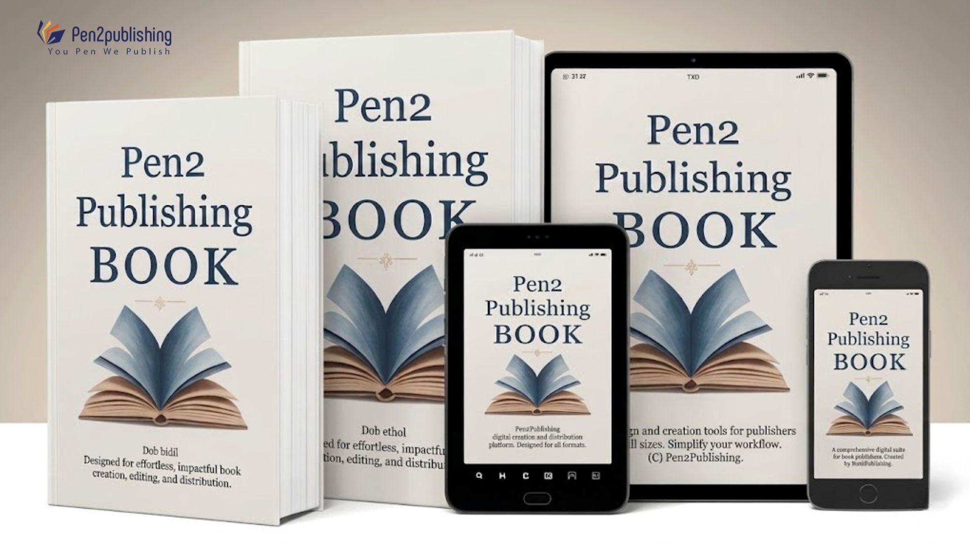
We offer complete typesetting services for both print and digital publishing print-ready PDF layouts built to precise industry specifications, clean EPUB files tested across devices and platforms, and formatting that meets the requirements of KDP, IngramSpark, and other major distributors.
Every project is handled by people who understand both the technical requirements and the visual craft of professional book design. If your book deserves to be read and it does, it deserves to look the part.
Practical Tips You Can Use Right Now
You do not need to become a typesetter to make better formatting decisions. A few straightforward habits go a long way. Keep your typography simple and consistent. One body typeface, one heading typeface, applied uniformly from the first page to the last. Test your eBook on real devices not just in a desktop preview before you submit it anywhere. Follow the technical specifications of your chosen printer or distributor, and check them again before you upload. And let readability lead every decision: if a design choice makes the text harder to follow, it is not worth keeping, no matter how attractive it looks in isolation.
Professional Typesetting Matters
Typesetting is not a finishing touch. It is part of what makes a book a craft that translates your writing into an experience that readers can actually sink into.
Whether you are publishing in print, digital, or both, investing in professional formatting is one of the most straightforward ways to raise the quality of your book and the confidence with which you release it. Readers notice the difference, even when they cannot explain what they are noticing. That is the whole point.
FAQs
1. What is typesetting in publishing?
Typesetting turns your manuscript into a properly laid-out book for print or digital. it is careful with the typefaces and with the space and the margins to make sure everything appears decent.
2. Why does typography matter so much?
Because readers feel it before they notice it. Good typography makes reading effortless. Poor typography creates friction that quietly drives readers away no matter how strong your writing is.
3. What fonts work best for books?
Serif typefaces are the long-standing professional standard for printed body text. Fonts like Garamond and Palatino guide the eye naturally through long passages without ever drawing attention to themselves.
4. Is eBook typesetting really that different?
Absolutely. Print layouts are fixed; every reader sees the same page. eBook layouts must reflow and adapt across different devices, screen sizes, and reading apps which requires a completely different technical approach.
5. Should authors hire a professional typesetter?
Professional typesetting ensures your files meet industry standards, your eBook works across every platform, and your book looks like it truly belongs in print.