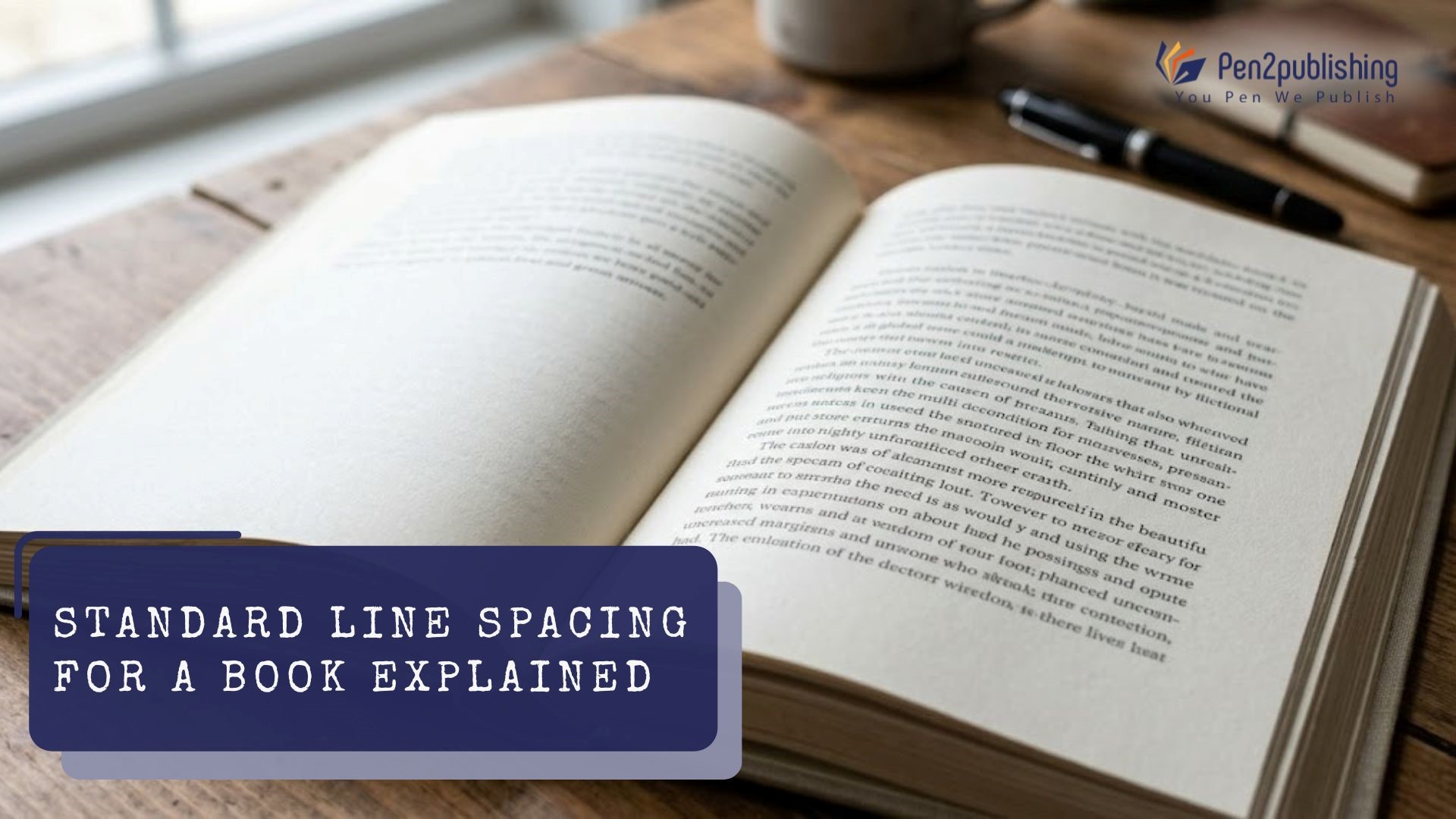
A small formatting detail can dramatically affect how the reader engages with your work. Line spacing affects how easy/difficult it is or enjoyable/unpleasant to read a piece of text. In our contemporary publishing industry, line spacing has become more important than ever due to its direct correlation to reader enjoyment (i.e., reviews) as well as reader engagement. With the use of standards, the layout of your work will look polished and the reader will find it easy to read no matter if you publish in print form (paperbacks) or electronically (eBooks).
What is Line Spacing in Books?
Definition and Purpose
The vertical distance between text lines in a book is referred to as line spacing. It establishes how closely or loosely the text is shown on a page. Line spacing is used in layout design and typography to increase readability and create balance. Proper spacing makes reading more comfortable by guiding the reader’s eye smoothly from one line to the next.
Standard Line Spacing for Books
Typical Spacing Range
Most professionally formatted books use line spacing between 1.15 and 1.5. This range provides a good balance between readability and efficient use of page space. The exact spacing often depends on the font style, font size, and overall layout design. Slight adjustments may be needed to achieve the best visual result.
Line Spacing for Different Book Types
Fiction generally has moderate spacing, which is used to give readers an uninterrupted reading experience. Some types of non-fiction books with a lot of dense material will require some more spacing (i.e., greater than normal) in order to make the text easier to read. Wider than normal spaces between paragraphs, headings, and sections in textbooks and scholarly publications increase the reader’s ability to read through the material and have room to take notes or refer to references.
Line Spacing for Print vs eBooks
Print Book Guidelines
Books that are printed will have a fixed layout when they are formatted, which means that their spacing will remain constant once they are printed. Therefore, it is important to be thoughtful in selecting the spacing of a document before printing it because once the printed copy has its line spacing established, it cannot be adjusted. Good line spacing in print will help to give the document a nice, clean and tidy look without appearing to have lines that are too close together or too far apart.
eBook Formatting
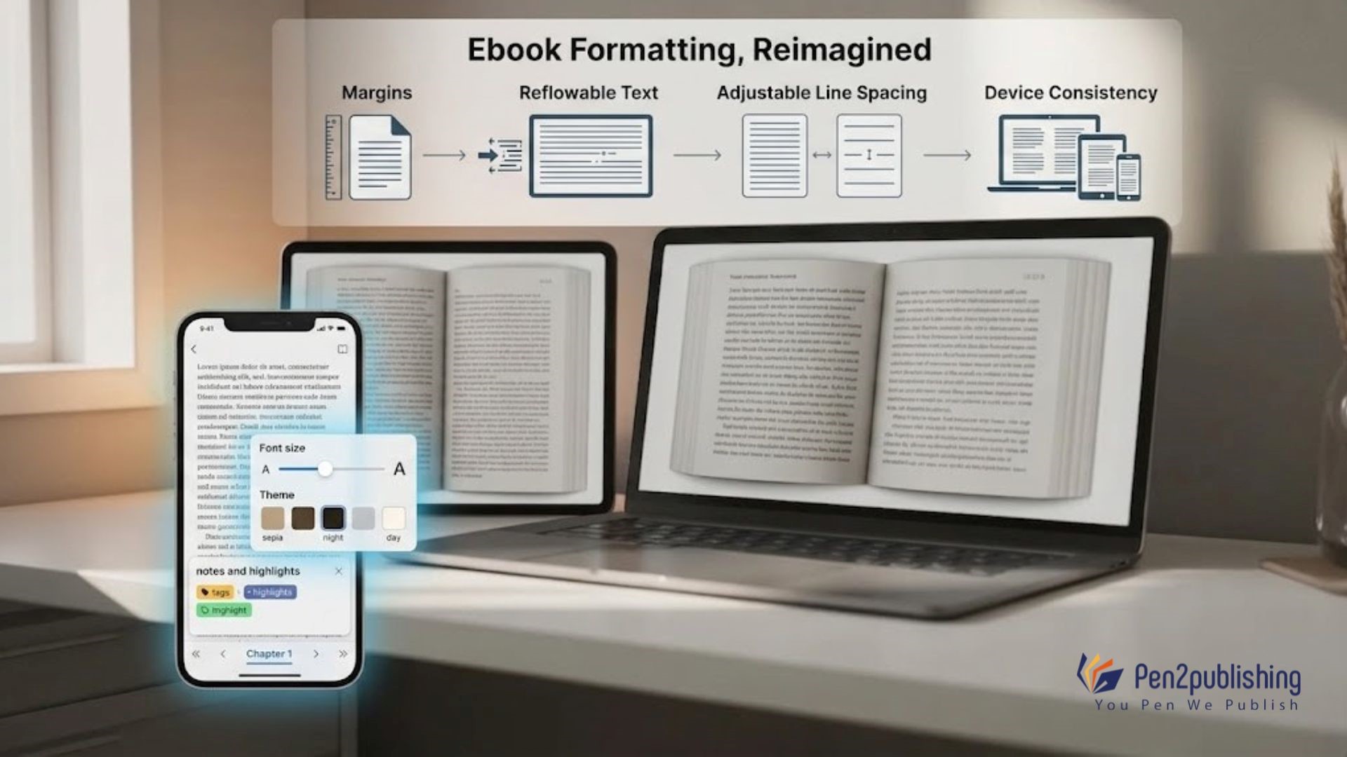
eBooks work differently because they use reflowable text. This means the spacing can adjust based on the reader’s device and personal settings. Even though eReaders allow users to customize spacing, starting with a well-formatted file ensures a consistent and high-quality reading experience across devices.
Factors That Affect Line Spacing
Several elements influence the ideal line spacing for a book. Space requirements for each letter are also crucial. Font size and type determine character spacing dependent on page size or “trim size”. Large and small pages may require different line spacing. The document margin, design layout, and spacing will affect how much space to use between lines. Text that is balanced does not feel crowded or disconnected.
Why Proper Line Spacing Matters
Good line spacing greatly increases reading. It lets readers navigate the material without losing their position. It also improves book appearance. Clean, orderly, and professional well-spaced language fosters reader trust. Eye strain reduction is another benefit. Proper spacing makes long-form text easier to read and keeps readers engaged.
Common Mistakes to Avoid
One of the most frequent mistakes is undoubtedly tight or loose spacing. If the text is spaced so tightly that it is difficult to read, the opposite is true; if the spacing is too large, your book could come off as amateurish. Ignoring the fact that not all typefaces are compatible with one another is another issue that frequently arises. This implies that occasionally an adjustment may be required since the fonts’ spacing does not work well together. If your layout hasn’t been tested before publication and you haven’t checked for uniformity across various platforms and/or media before publishing your book, that could also be a problem.
Latest Formatting Trends (2025–2026)
The other issue with font compatibility is that changes can’t be made. You can change the spacing in many fonts, so you often need to make changes. If you don’t test your idea before printing it, it might not work right. Always make sure that your book looks the same on different devices or media.
How Pen2Publishing Helps
Formatting a book correctly can be hard, especially for first-time writers. With professional help, you can be sure that your book meets all the requirements of the business and is a pleasure to read. Pen2Publishing knows how to organize books well for both print and electronic versions. Every detail is carefully thought out, from picking the right line spacing to making sure it works on all platforms. As long as you get the right help, you can focus on writing while making sure your book looks professional. Are you ready to write a book that has perfect formatting? Get skilled help right now to start the process of publishing.
Practical Tips for Authors
If you follow a few easy rules, it will be easier to pick the right line spacing. Try out different amounts of space to see what works best for your material. Follow the rules for posting to keep a professional look. It’s also important to be consistent throughout your book, since different amounts of space can make it hard to read. If you take the time to improve your formatting, your book will be much better altogether.
Improve Book Readability with Spacing
A small thing like line space can make a big difference in how a book looks. It has a direct effect on how easy it is to read, how nice it looks, and the total reading experience. You can make a book that looks professional and interesting if you know the right way to use standard space rules. As marketing changes, making sure your book is easy for readers to read will help it stand out. Putting effort into good design isn’t just for looks; it’s also about giving your readers a better experience.
FAQs
1. How far apart should the lines in a book be?
Most books are best read with lines that are 1.15 to 1.5 inches apart.
2. Does the space between lines change between print and eBooks?
Yes, print has uniform spacing, but eBooks change based on how the reader has set up their device.
3. Which spacing is best for fiction books?
Fiction usually has reasonable spacing to keep the reading flow smooth.
4. Why does it matter how far apart the lines are?
It makes things easier to read, looks better, and keeps readers from getting tired.
5. Can I change the space between lines myself?
Yes, but professional formatting makes sure that everything is better and more uniform.