
Why Typography Strategy Will Be Important in 2026
You can now use digital publishing systems on PCs, tablets, smartphones, and eReaders all at the same time. The resolution, scaling algorithms, and user customization settings on each device change how fonts look. So, typography needs to be flexible instead of based on guesses about how print works. Professional publishers consider a font’s readability, neutrality, and consistency across various platforms. eBooks formatted with the ideal font and size will display fluidly on responsive layouts. Likewise, if you’re using a clear typeface, it gives the impression that you are an editorial authority because there are many other competitors in the online marketplace.
Cognitive Flow and the Reader’s Experience
Giving readers the proper visual breathing space & typographic rhythm will impact how much they stay engaged with the content. If you read something that is poorly formatted for a long period of time, you will have difficulty processing the text; therefore, it will be challenging for you to immerse yourself into the book. Conversely, if your typography is balanced, reading and scanning the content displayed on the monitor/television will be easier for you. The size of the letters used on each line is critical to determining how easy it will be to read the book for extended periods of time. When selecting the most appropriate font/typeface and point size for eBook publications, experts place ergonomics first.
Serif vs. Sans Serif in E-book Publishing
The debate over serif vs. sans serif is still shaping conversations about digital typography around the world. Serif fonts have traditionally been the best for reading long texts because they guide the reader’s eye in a structured way. But modern high-resolution screens have made sans serif much better at what they do. The best font and size for an eBook depend on the genre, the audience, and the brand’s position in the market. Serif typefaces are often good for fiction titles because they make them easier to read and more familiar. Technical or business publications often use sans serif clarity to make sure that the information is accurate.
Screen Optimization and Rendering Behavior
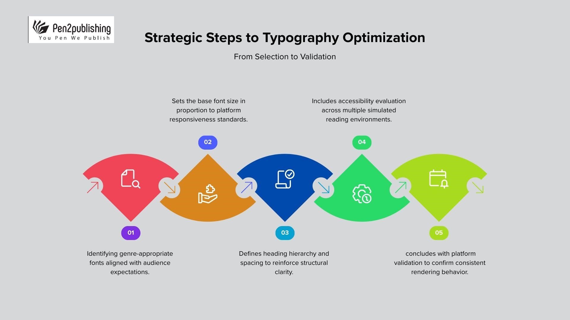
Rendering engines interpret font curves differently depending on device firmware and platform architecture. Fonts designed specifically for digital environments generally perform better across multiple e-reading systems. Professional publishers test typography within Kindle, Apple Books, and EPUB validation environments. Having consistent formatting and font choices across all platforms will allow eBook formatting decisions to be made consistently. It is also suggested that screen optimization testing occur prior to final typographic approval in production workflows.
Ideal Font Size Standards for Digital Reading
Generally speaking, readers have the ability to change the eBook’s font size on most retail platforms. However, the base font size setting typically plays a role in how the rest of the text scales and how the overall layout appears.
Most industries will use the body text size of 10-12pt for reflowable formats, but when formatting eBooks, the primary consideration should be the response of the device.
If the base font size is too small, it will cause hierarchy compression and decrease how prominent headings are to the reader, thus making navigation more difficult for the user. If the base font size is too large, this will negatively impact the overall balance of the document and alter the reader’s perception of the density with the content.
Hierarchy and Heading Scale Proportion
Professional ebook formatting depends on consistent heading ratios relative to body text. Having a clear typographic hierarchy provides better user navigation and improved accessibility compliance, along with support for the automated generation of tables. The levels should progress steadily up the size scale without any dramatic jumps that may distract the reader’s attention. Using the same font and size throughout an eBook framework will ensure proportional harmony among all the chapters of an eBook. As a result, establishing structure will help you create credibility in the field of professional digital publishing environments.
Accessibility and Inclusive Typography Standards
In global publishing markets, an increased number of regulations regarding accessibility are beginning to have a greater effect on how typography is being implemented throughout the world. For instance, readable fonts that clearly differ in shape will allow more people to read the product with various differences in sight. Fonts that have open counters and balance their stroke contrast against one another will make text readable on screens with many different brightness levels. Furthermore, the best font and size for eBook strategies will consider accessibility from the very beginning of the eBook project. Finally, scalable typography will ensure that typography can perform on adaptive interfaces as well as any assistive technology.
Line Spacing and Margin Considerations
Line spacing must provide adequate breathing room without fragmenting narrative cohesion. Professional standards typically recommend one hundred twenty to one hundred fifty percent spacing. Margins in reflowable ebooks remain flexible yet should preserve visual equilibrium. The consistent design of balanced whitespace provides a continual engagement through longer sessions of reading. Therefore, the spacing decisions will complement the best Font and Font Size that will work in conjunction with the ebook Optimization strategy.
Platform-Specific Considerations and Compatibility
Each ebook retailer uses proprietary rendering logic to render the uploaded file, for example, Amazon kindle devices will automatically substitute any unsupported fonts during the ingestion of the ebook. Apple Books often preserves embedded fonts if compliance standards are satisfied. Cross-platform trial validation is needed to determine the optimum font and font size for an eBook. Trial validation ensures no unexpected substitutions affect branding and/or readability across any platform.
Embedded Fonts and File Optimization
The benefit of embedding fonts is to provide you with greater control over the appearance of your eBook throughout all platforms. The limitation to embedding is that it must also be done within the guidelines of the chosen distribution platform. Improper embedding can increase the size of your eBook file or generate validation errors when you submit it for distribution. Professional publishers balance customization with technical compliance requirements carefully. Evaluating the embed requirement in terms of the eBook font & size, along with optimizing file formats appropriately, will affect typographic policies within the context of Digital Publishing.
Typography And Brand Identity Alignment
Typography provides a strong but subtle link to the brand message that is communicated to the consumer through the use of typography in an online retail space. Using the same font throughout a series helps build name recognition in a crowded marketplace. Professional publishers will typically use the same typeface for the interior of a book as they would for the cover and other visual aspects of their books. The font and font size used for the purposes of an ebook strategy also apply beyond interior formatting; they will create the same brand cohesion through the metadata preview of the ebook and the excerpt of the ebook sample.
Data-Driven Typography Decisions
Analytics tools are now giving us insight on reader engagement based on reading completion trends. The way text is written and displayed will impact the possibility of readers finishing a long-form or serialized content piece. Any professional experimentation needs to be based on quantitative engagement metrics. Data feedback will help determine the best font and font size to refine eBooks.
Best eBook Font & Size Strategy 2026
Selecting the best font and font size for eBook publishing requires strategic foresight. In terms of readability, accessibility, brand identity and compatibility with different distributions, typography affects all four of these factors at once. In 2026, the publishing industry professionals will have to choose fonts with precision to enable optimal function in the digital medium. As a result of proportional scaling and formatting, there will be a clear hierarchy of text and it will be accessible to everyone. There will also be cross-platform validation to create consistency among the various ecosystems of readers. Ultimately, excellent typographic choices will help create an elite group of forward-thinking ebook creators who will differentiate themselves from their competitors in the global marketplace.
FAQs
1. In 2025, what is the best font for creating a professional eBook?
Serif fonts (e.g. Georgia) and sans serif fonts (e.g. Helvetica) are acceptable for most devices or platforms for display purposes.
2. What font size is appropriate for eBooks?
A base size of 10 to 12 points ensures that text is legible across all main eReading platforms.
3. Do eBook files need to have fonts in them?
Fonts can be embedded for brand control, but you need to make sure they work with all platforms first.
4. How does the typeface affect getting people to read again?
Clear hierarchy and even spacing make things easier on the eyes, which increases interest and completion rates.
5. Why is it important to test fonts across platforms?
Testing makes sure that the display is the same on all platforms, including Kindle, Apple Books, and EPUB.