The format of a poetry book requires absolute precision as the way it looks directly affects how a reader finds meaning and emotional impact. In the ways that we currently publish, formatting can affect how a reader interprets rhythm, pauses, and structural elements of poetry. Due to heavy reliance on spatial layout, formatting becomes a very important element of both the creative and technical responsibilities of a publisher. The impact of poorly formatted poetry disrupts the intent of the poet and diminishes the overall experience for readers; thus, learning how to properly format a poetry book is essential for authors, editors, and those working in the publishing industry who want to deliver professionally formatted poetry books. The appropriate format for the poetry book creates an easier reading experience for the reader; it provides a better context for the poem as an artistic expression; it meets the production standards typically required today in publishing.
Why Poetry Book Formatting Requires a Unique Approach
Poetry formatting differs significantly from standard book formatting due to its dependence on visual structure. Format impacts the meaning of each line break, the spacing between stanzas, and the indentation of the lines within the composition. The nature of formatting is, in this sense, an extension of the poet’s voice rather than a simple technical requirement. As such, publishing professionals should maintain respect for the original voice of the poet, while also ensuring compatibility with current production systems. The successful Formatting of poetry books today depends on successfully balancing the artistic and technical elements of the formatting.
The Relationship Between Form, Rhythm, and Visual Layout
Intentionally spacing poems on a page in an orderly fashion creates a rhythm for the reader. A well laid out visual format allows the reader to pace him or herself accordingly and emphasizes when he or she should pause, take breaks, and transition emotionally, more than an unorderly or incorrectly formatted poem. Incorrectly formatted poetry can distort or completely change the way a reader interprets the poem compared to its intended meaning. Therefore, the integrity of a poem’s layout should be preserved when creating a poetry manuscript for publication. It is the responsibility of those producing the manuscript to ensure that their layout decisions meet both the artistic and technical standards.
Preparing Your Poetry Manuscript Professionally
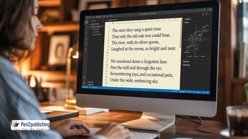
Manuscript preparation forms the foundation for efficient formatting and successful publishing outcomes. Clean, well-organized documents reduce errors during editing, design, and conversion processes. According to publishing experts, it is important to eliminate inconsistencies in style or formatting prior to layout. A structured manuscript helps facilitate seamless transference of files between print and digital production. Proper preparation will provide support for both your creative expression and technical consistency.
Organizing Poems, Sections, and Thematic Flow
When organizing poems, it is best to arrange them in a logical way that takes the reader on an engaging reading journey. You can also categorize poems into thematic sections that will allow the reader to relate to the emotion conveyed by a collection of poems over time. The same formatting style should be applied to each poem throughout the manuscript so that the presentation of material within the book will be uniform and look professional. You must have clear section breaks defined to ensure you have developed a framework that will continue to hold structure throughout the formatting and publishing processes. By using effective organization, you enhance both the overall impact and readability of your poetry book.
Typography Choices for Poetry Books
The way in which a poem is portrayed via its typography is vital to the way in which it will be read and interpreted by the reader. In selecting the font that is appropriate for a poem, the formatter has the challenge of balancing both the readability of a font and the style of the poem. Publishers will typically select fonts that are simple and clean to ensure that the font does not distract from the poetic message. The appropriate font selection will contribute to the emotionality of the poem while ensuring clarity in all formats. For that reason, the decision regarding the font to be used should take into consideration both the artistic intent and industry standards.
Selecting Fonts and Maintaining Readability Without Losing Style
Fonts that have good readability help readily reveal any unique poetic characteristics regardless of where a reader is reading the poem. Furthermore, excessively ornate fonts can create barriers to understanding and disrupt each reader’s ability to connect to the poem. Consistent use of fonts throughout the book reinforces visual harmony and contributes to a professional appearance. The font size that you select needs to be precise enough to provide balance to your page getting too full. Typography in a poetry book functions both aesthetically and functionally as being readable.
Managing Spacing, Line Breaks, and Alignment
Spacing and alignment are two critical components of a poem’s visual rhythm. Each line break should correspond with how the poet is pacing and emphasizing emotion within their work. Incorrect spacing will change the meaning of that poem significantly and can cause it to have considerably less impact on the reader. Therefore, during formatting processes, publishing professionals should closely manage both of these elements. Spacing correctly will maintain the original poetic structure.
Preserving Poetic Structure Across Print and Digital Formats
Maintaining structure amongst format variations calls for a focus on both layout and consistency of format. Poetic Arrangements that are well-designed, may be spoiled by digital format text reflow. Experts need to validate format across various device platforms to verify successful replication of formats. Complex/polished poetry may require fixed layout options in certain digital formats. Structure needs to be maintained for poetic integrity.
Page Layout and Visual Balance
The layout of a page has an effect on the way that readers will engage with poetry and how it will visually appear. Poets want, and will need, a balance of text to give them an enjoyable reading environment. The use of margins and spacing should allow for plenty of white space around the text to repeat the same effect. When poets can visually balance their work they will provide a clear presentation of their poems without unnecessary busy elements cluttering their pages. The design of the overall layout will play an important role in how successful the entire poetry collection will be.
Margins, White Space, and Consistent Presentation
Margins must be consistent throughout the book to maintain a uniform appearance. White space plays a vital role in emphasizing poetic pauses and visual clarity. Consistent presentation across pages reinforces professionalism and reader engagement. The publishing profession places great importance on consistency in a product’s layout, as it directly relates to the ease of reading material and provides quality aesthetically. Use of white space in a proper manner also helps enhance the overall impact of poetry.
Formatting for eBook and Print Compatibility
Poetry books must work well in both print-based and electronic media if they are to succeed in today’s publishing industry. Each medium presents specific issues that must be taken into consideration when formatting poetry books. The print layout will typically remain locked in place, while the ebook layout will change configuration to fit an infinite number of device sizes. The professional can ensure that there is compatibility between both forms without sacrificing the original integrity of the poetry content. By using sound strategies in formatting, professionals can create an easy transition from one publishing format to another.
Handling Reflowable Text and Fixed Layout Challenges
Reflowable text can interfere with the placement of breaks between lines and spaces in a poem, while fixed layout formats retain the arrangement of the piece but may also limit access to all devices. The publishing professional needs to assess the best fit case scenario for each specific type of poetry when considering format because each type assumes a different format and needs to be tested against all platforms to ensure proper rendering and the reader’s experience. There must be a balance between flexibility and control in the new modern way of publishing poetry.
Industry Expectations and Common Formatting Mistakes
Publishing standards require poetry books to meet both aesthetic and technical expectations. Not following the proper format can result in not getting accepted or being well-received in the marketplace. Some of the mistakes that people make regularly are uneven space between items on a page, not aligning things correctly, or selecting the wrong typeface. These problems need to be addressed by publishing professionals when they are producing their work. By meeting the standard of publishing, it provides quality and improves the reader’s experience with that publication.
Avoiding Errors That Affect Publishing Quality and Reader Experience
A professional writer can obtain a proper formatted manuscript in accordance with the standards of template-based formatting. Before poetry is published, writers should continually monitor their formatting and test to make sure it has been formatted properly prior to being submitted to a publisher. Template-based formatting is an excellent way for professional writers to create their scripts in accordance with proper formatting. The author’s attention to detail will also help create high-quality poetry books. By avoiding repeatedly making the same common formatting mistakes while developing a poetry book, reader engagement as well as presentation quality will be significantly enhanced.
Tools and Best Practices for Professional Formatting
In comparison to earlier days, technological advancement offers an easier way to create a formatted book of poetry. Having access to word processing programs and graphic design software, writers can be very specific when determining the layout, type of font used, etc.; this concentration of control (i.e., time spent on layout) results in less time for the project as well as improved quality upon completion of the project. In addition, if publishers implement best practice methods throughout production, they can achieve consistency and reduce the potential for errors in the entire production process. In summary, technology can significantly enhance the efficiency and overall quality of a published work.
Leveraging Word and Formatting Software Efficiently
Word processing tools enable structured formatting through styles and templates. Design software offers greater flexibility for complex layouts and visual elements. In order to create the best possible outcome for formatted poems, it is common practice for professionals to use more than one tool. To have effective workflow operations, you must understand the individual strengths of each tool used for formatting. When the proper tools are utilized, accuracy can be enhanced and standards of professional publishing are supported.
Poetry Formatting for Professional Books
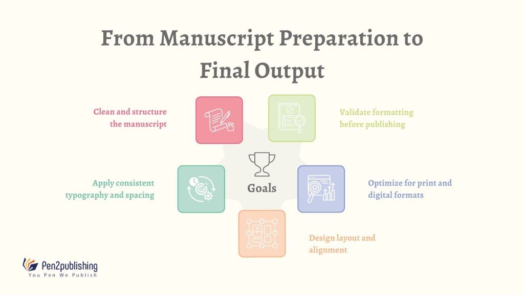
Formatting poetry books is an industry-specific skill that combines sensitivity to art with technical knowledge. Formatting decisions that affect how readers will relate to poetic content. It is important for professionals in publishing to approach creating an aesthetically pleasing and consistent manner, while producing high-quality results. The success of a poetry book will be determined by how well each stage (from preparing manuscripts to final layout) is executed; mastering these techniques gives authors and publishers a better chance of producing a professional poetry book.
FAQs
1. Why is poetry formatting different from regular books?
Poetry relies on spacing, line breaks, and layout to convey meaning and rhythm effectively.
2. What font is best for poetry books?
Simple, readable fonts ensure clarity while maintaining the aesthetic tone of the poetry.
3. How do line breaks impact the format of a poem?
The line breaks determine the pacing, emphasis and rhythm of the poem, hence they are essential to all types of poetry.
4. Should poetry books use fixed or reflowable layouts?
The complexity of the poem may affect if the fixed layout retains the correct structure of that poem.
5. what is the largest formatting error in poetry collections?
Inconsistent spacing and alignment can distort meaning and reduce overall readability.