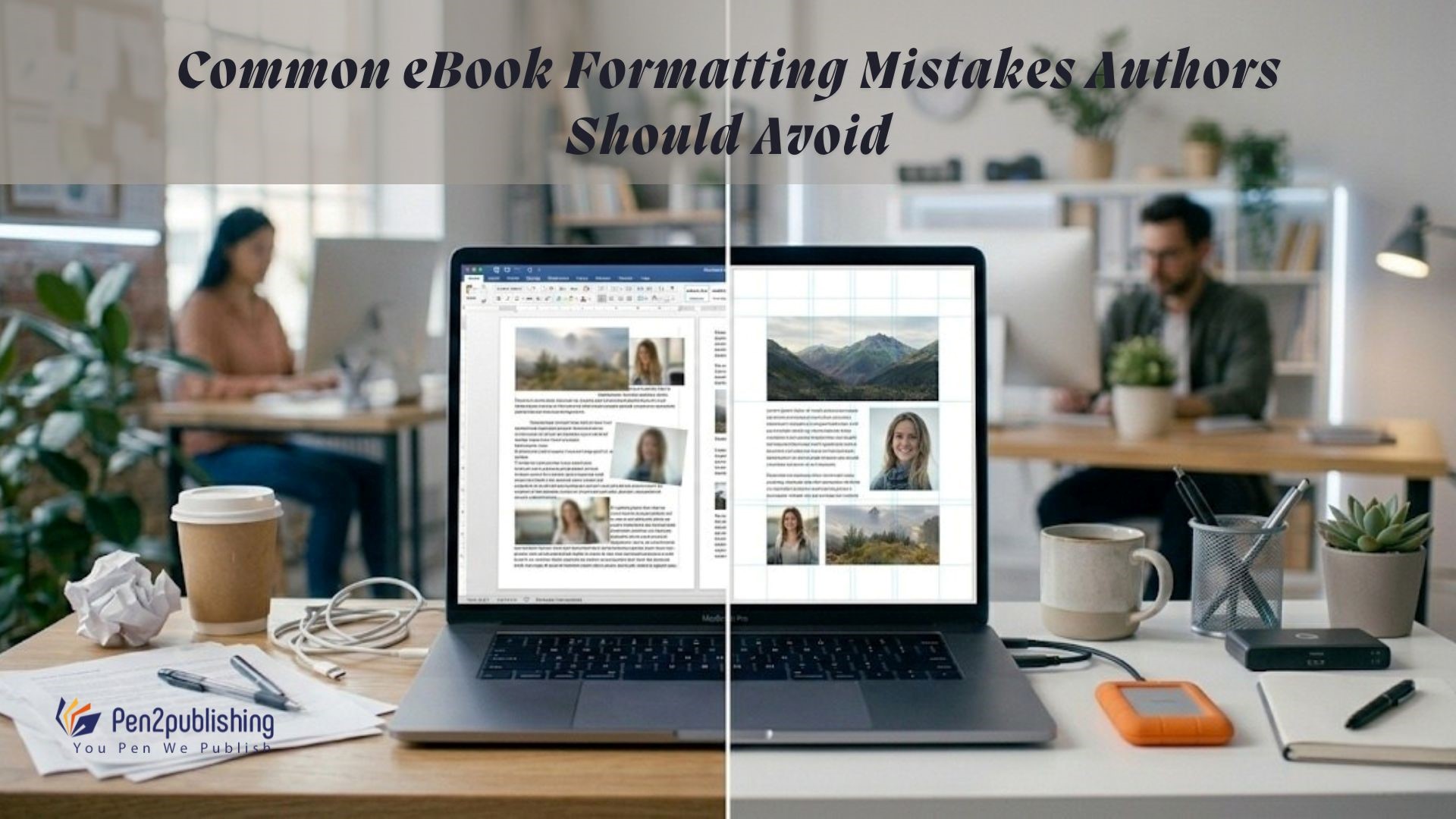
Common eBook Formatting Mistakes Authors Should Avoid
- By Priyanga

Ebook publishing has become easier, making it possible for authors and independent publishers to sell digital books all over the world. But just because something is easy to get to doesn’t mean it’s always of high quality. Many authors spend months or even years writing a manuscript, but they don’t pay attention to how to format it for an ebook when they publish it. Formatting mistakes may seem small, but they can have a big impact on how easy it is to read, how well it works on different devices, and how enjoyable it is for the reader overall.
If the formatting is bad, the layouts may be distorted, the typography may not be consistent, the tables of contents may be broken, or the text may not be readable on all devices. Publishing platforms have very strict rules about how eBooks should look. If a book doesn’t follow these rules, it could be turned down or get bad reviews from readers. If authors know what the most common mistakes people make when formatting eBooks are, they can avoid having to make costly changes and present their work in a professional way. Finding these mistakes early on will help authors make sure their eBooks are fun and easy to read.
Why Proper eBook Formatting Matters
Formatting is more than visual organization. It directly influences readability, accessibility, and the perceived professionalism of a book. Readers expect a seamless reading experience regardless of whether they use a smartphone, tablet, or dedicated eReader device. If the formatting is wrong, it can ruin the experience and make readers stop reading the book right away.
Amazon Kindle Direct Publishing, for instance, mandates a specific format for e-books. By following these guidelines, books will display properly on screens of all sizes and operating systems. Professional formatting improves reader satisfaction, maintains the author’s credibility, and increases the likelihood of positive evaluations.
Most Common eBook Formatting Mistakes
Using Inconsistent Fonts and Typography
Typography helps keep your content readable and attractive at the same time. One of the biggest mistakes a writer makes is using multiple fonts throughout a single document. This often occurs when writers choose decorative fonts for body text, making it difficult for the reader to follow the text’s flow. The majority of professional ebooks use a simple, legible typeface, ensuring the reader can easily identify headings and body text. If you choose one typeface throughout the entire ebook, the finished ebook will appear professional and neat.
Improper Paragraph Spacing and Alignment
Another frequent mistake involves incorrect paragraph formatting. Authors often use manual spaces or multiple line breaks instead of proper paragraph settings. These shortcuts may appear acceptable in word processors but can cause layout issues during ebook conversion. When you read a book on different devices, some paragraphs might collapse, move, or not look uniform. By applying consistent paragraph styles you can be assured of consistent formatting across all types of ebook readers.
The Wrong way to use Page Breaks
Using page breaks is one way to maintain the proper format of ebooks. Many authors use multiple line breaks at the end of each chapter, rather than a properly implemented page break, but when ebooks are converted into digital formats it is often seen as a way to cause the beginning of a chapter to be randomly placed. Using the correct page breaks will provide for consistency in the location of the beginning of your chapters as you convert your books into various ebook formats.
Poor Image Formatting
Images enhance storytelling, educational content, and visual engagement. However, poorly formatted images can disrupt the layout or appear distorted. Common image-related mistakes include oversized images, low-resolution graphics, or incorrect alignment. Images should be properly scaled and placed to maintain consistency across screen sizes. Incorrect image formatting can also increase file size unnecessarily, which may affect download performance.
Ignoring Table of Contents Formatting
A functional table of contents is essential for ebook navigation. Readers rely on clickable navigation to jump between chapters easily. Authors sometimes create a static table of contents without linking chapters correctly. When links are broken or missing, it’s hard for readers to get around. An interactive table of contents that links directly to each section of the book is included in properly formatted ebooks.
Too Much Manual Formatting
Instead of using the built-in formatting tools, many authors prepare their papers by hand. This approach creates inconsistencies, which frequently occur following an ebook conversion. When you format a document by hand, you might have to change the spacing, tabs, or alignment by hand. Instead of making the same changes over and over again, professional ebook formatting uses structured styles. Using the same styles every time makes digital publishing more reliable.
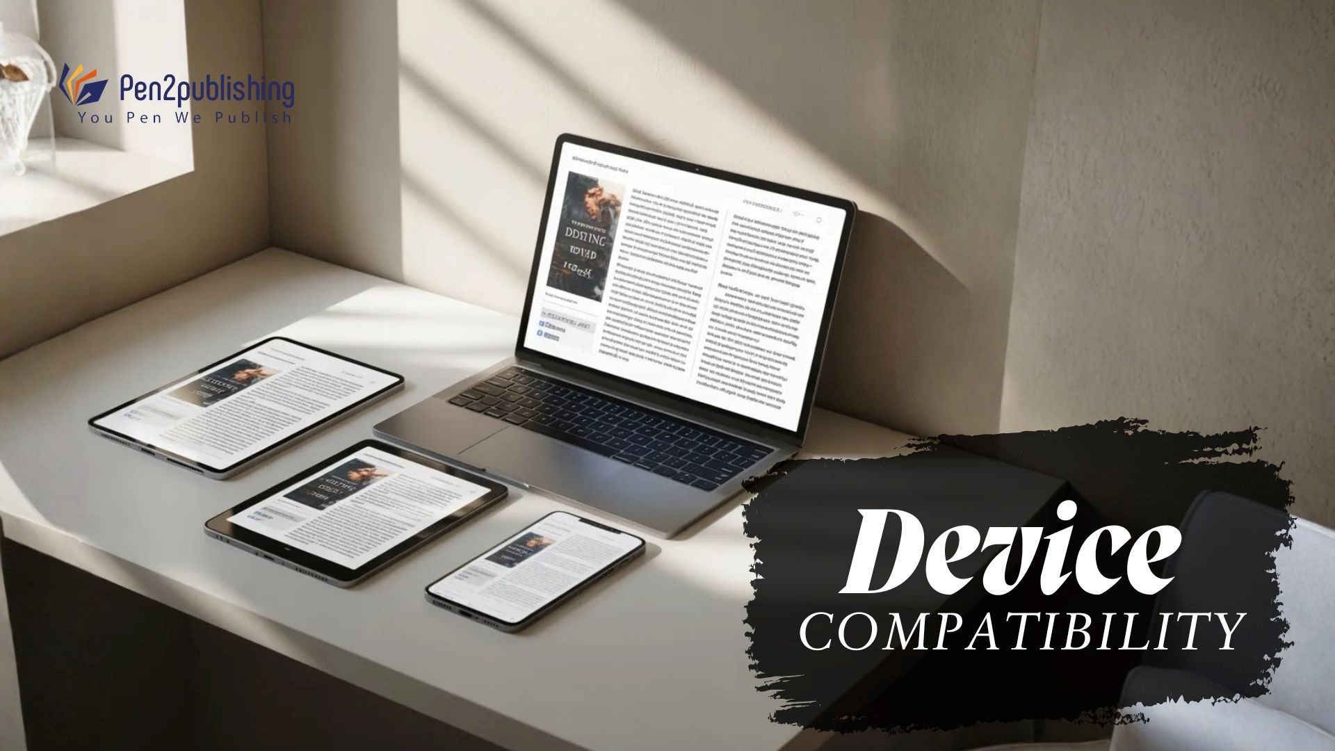
Ignoring Device Compatibility
Ebooks are designed to adapt to multiple screen sizes. Readers may access content on smartphones, tablets, laptops, or dedicated reading devices. Some formatting choices look acceptable on one device but fail on others.
An example of this is that the eBook may not fit correctly on some smaller devices; therefore testing the eBook on all the devices you can before releasing/selling it to your audience will give you an idea of the overall readability of your eBook.
Complicated Layouts
Converting ebooks with complicated layouts into digital formats can lead to difficulties in retaining the original design, such as turning tables and multi-column layouts; therefore, many will find it hard to convert ebooks with complicated designs into digital formats.
One of the primary issues with converting printed books to ebook format is that many printed books are manufactured with a one-size-fits-all book layout; but when converting, they need to have a layout that will resize to fit the screen size of the device on which they were originally printed out. If the formatting is too complicated, it can break up the document and confuse readers. Keeping layouts simple makes them easier to read and more compatible.
Forgetting Metadata and Front Matter Formatting
Metadata plays a critical role in ebook discoverability. It is common for writers to overlook aspects of formatting their book in Festive eBook format, particularly; their title page, copyright page, and author information. Front Matter should have clearly defined and formatted sections across all devices! Additionally, accurate Meta Data assists the ebook store and search engines in locating, sorting, and displaying the book correctly.
Tips for Avoiding eBook formatting mistakes:
The best way to begin avoiding formatting errors is to have the proper tools and to follow a structured workflow. Authors should begin formatting on their manuscript as soon as they begin the manuscript preparation process rather than waiting until the end of the manuscript development process. Authoring with styles for headings, paragraphs, and spacing helps to ensure uniform formatting throughout the document. Authors should also use formal formatting tools to help them locate problems prior to submitting their eBook for publishing, including: wrong font sizes; misaligned text; and inconsistent spacing; which may adversely affect overall readability and presentation of the eBook. Testing tools should be used to see how the eBook will look on multiple devices and help the author to locate any formatting errors prior to reader review of the eBook. Many Testing Tools can simulate the appearance of the eBook on a variety of platforms and screens at different resolutions.
Professional Tools for eBook Formatting
Several tools assist authors in producing well-formatted ebooks. If you use the word processing application properly, you can get basic formatting. However, if you want to create a more professional layout, ebook formatting software includes more functions to create a layout that looks professional. The software that is used by publishing professionals includes formatting software that is specifically developed for digital publishing, and these tools help you keep all files consistent when preparing them for distribution platforms. If you choose the correct software to format your publication, it will make the process of formatting your publication much easier and less likely than making a mistake, especially when you have many complex elements (images, tables, etc.) or detailed layouts that require you to have a professional to do them.
When Authors Need Professional Formatting
Formatting can become complex, especially for books containing images, tables, or detailed layouts. In such situations, professional ebook formatting services can provide valuable support. Formatting experts know what publishers want and how to make sure that devices can read their work. They make sure that ebooks follow the rules for the platform and look good on all devices. By focusing on content creation (i.e., book writing), authors have the luxury to concentrate on writing without worrying about formatting an ebook because they have hired someone (i.e., a Technical Expert) to format/enhance it appropriately for their target audience. When this occurs, the quality of an ebook will be increased and readers will receive an ebook in which they are happy to read.
Professional ebook formatting should enhance and refine the overall reading experience. Even small mistakes in formatting can make it harder to read, navigate, and enjoy the book. By understanding the most common ebook formatting errors, authors can avoid problems that may disrupt the publishing process. Consistency in typography, spacing, navigation, and image formatting ensures that ebooks appear professional across devices. Careful attention to formatting improves reader engagement and strengthens an author’s credibility in the digital publishing world. With the right approach and tools, authors can transform their manuscripts into high-quality ebooks ready for global distribution.
FAQs
1. What is the most common ebook formatting mistake?
Using inconsistent fonts, spacing, and paragraph styles is one of the most common formatting errors in ebooks.
2. What makes Ebook Formatting Important?
Ebook formatting is important because it will allow electronic reading platforms to recognize your work, and because your ebooks should work on many different devices, as well as give them a professional appearance.
3. Will ebook formatting errors cause an ebook to be rejected?
Yes, ebooks with formatting errors that violate platform standards may be either rejected or misrepresented.
4. How to fix ebook formatting?
Before publishing, an ebook must have properly designed layouts, page breaks, and be readable on numerous devices.
5. Should ebook authors hire someone to format their ebooks?
Specialized ebook formatters can assist authors format their publications with visuals or unique formats to ensure technical accuracy. Without ebook formatting knowledge, authors may struggle to achieve the same result.
Related Blogs you Might be Interested in

